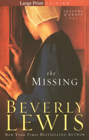
Recently I noticed that several adult novels seemed to have very similar covers and I wondered about this and what the publishers are trying to convey. In my case, the theme was the backs of women’s heads (see below). To me, this represents mysteriousness- any other thoughts out there?
Sure enough, there are people out there who research and comment on such things. See an interesting short article with a great collection of YA covers.
http://blogs.publishersweekly.com/blogs/shelftalker/?p=1581
The following website has some interesting discussion and analysis of graphics, composition, and effectiveness of various covers, as well as 2011 trends. It also has samples of rejected and accepted versions of covers.
http://www.winepressofwords.com/tag/showcase/
This site features very striking covers- see what you think!

Shira S.


